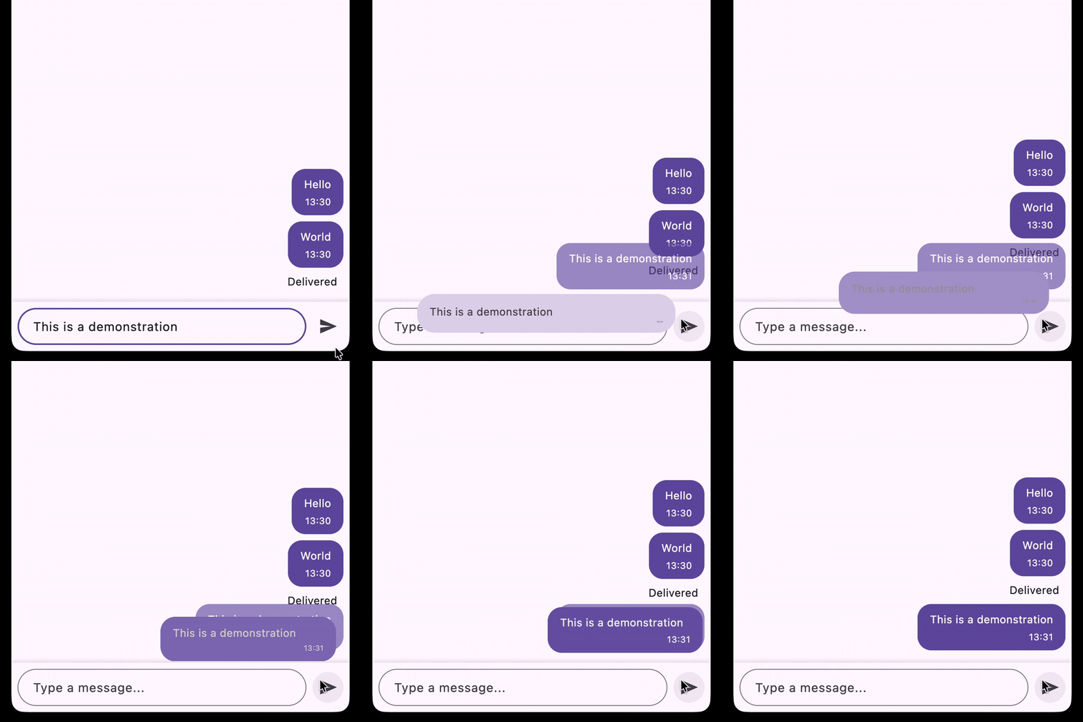
I would like to share a real case from a project I worked on. There is a chat screen. The task is to implement an animation for sending the bubble. In apps like WhatsApp and iMessage there is a particular animation when sending a message. All animation examples in this article will be slowed down for better demonstration:
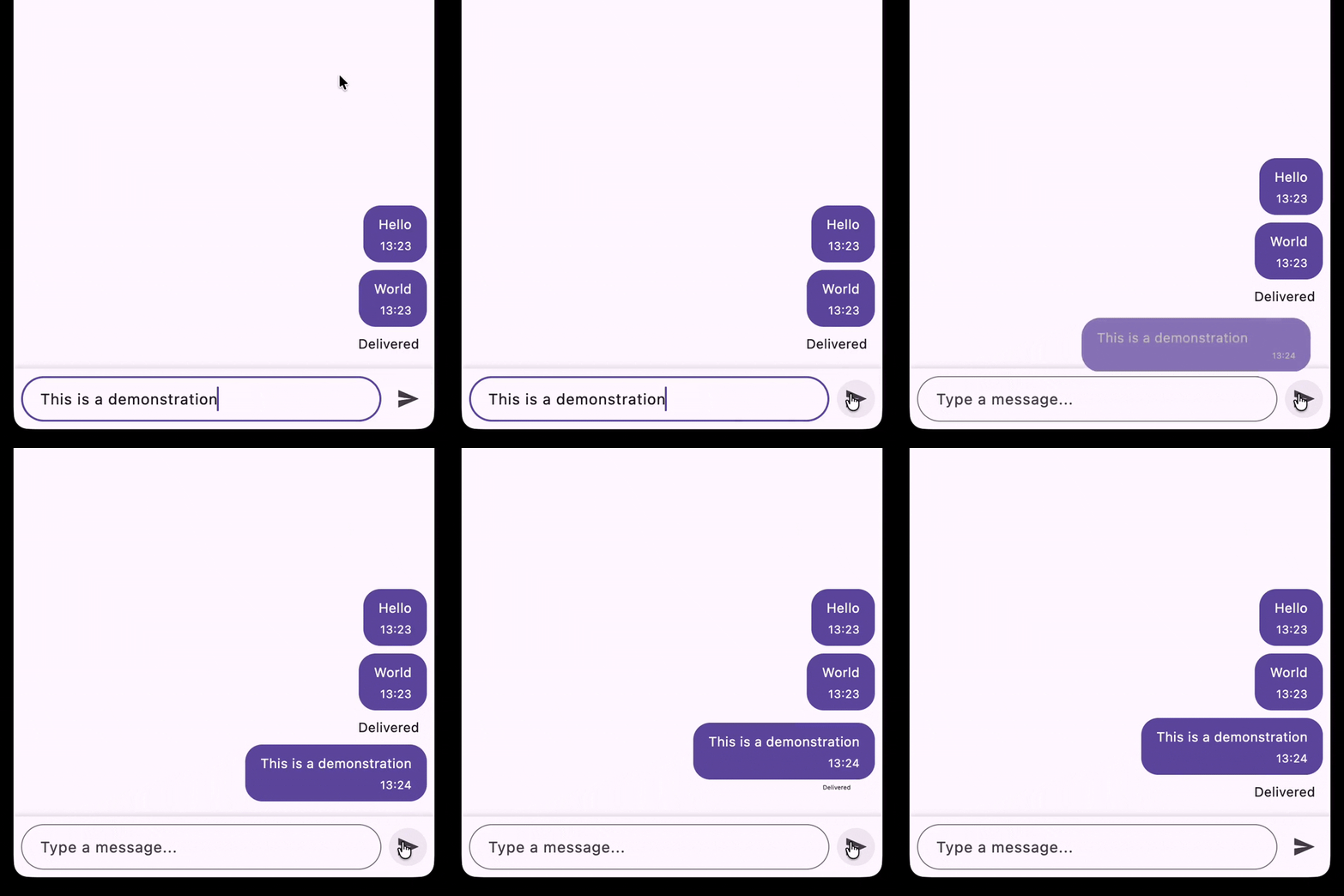
As you can see it’s a complex animation, the message bubble flies from the text field transforming its shape and content, then slides up over the “delivered” label. Initially I assumed that it’s a common pattern, so there should be some published package or a guide that would show how to implement such animations. However, I was very surprised that there is nothing that can help, so I implemented everything from scratch and in this article I’ll describe step by step how to implement such complex animations with Flutter.
Initial setup
We have a simple project with a single screen that has:
- Scrollable list of messages
- Text field with send button
class ChatScreen extends StatefulWidget {
  const ChatScreen({super.key});

  @override
  State<ChatScreen> createState() => _ChatScreenState();
}

class _ChatScreenState extends State<ChatScreen> {
  var _messages = <ChatMessage>[];

  final _textController = TextEditingController();

  @override
  void dispose() {
    _textController.dispose();
    super.dispose();
  }

  void _sendMessage() {
    final text = _textController.text.trim();
    if (text.isEmpty) {
      return;
    }
    final newMessage = ChatMessage(text: text, timestamp: DateTime.now());
    _textController.clear();
    setState(() => _messages = [newMessage, ..._messages]);
  }

  @override
  Widget build(BuildContext context) {
    const bubbleSpacing = 8.0;

    return Scaffold(
      appBar: AppBar(title: const Text('Chat Screen')),
      body: Column(
        children: [
          Expanded(
            child: CustomScrollView(
              reverse: true, // Start from the bottom, like typical chat apps
              slivers: [
                SliverToBoxAdapter(child: const SizedBox(height: 16)),

                SliverPadding(
                  padding: .symmetric(horizontal: 8.0),
                  sliver: SliverList.separated(
                    separatorBuilder: (context, index) =>
                        const SizedBox(height: bubbleSpacing),
                    itemCount: _messages.length,
                    itemBuilder: (context, index) {
                      final message = _messages[index];
                      return Align(
                        alignment: Alignment.centerRight,
                        child: Bubble(
                          text: message.text,
                          timestamp: message.timestamp,
                        ),
                      );
                    },
                  ),
                ),
              ],
            ),
          ),

          // Input field and send button.
          Container(
            decoration: BoxDecoration(
              color: Theme.of(context).cardColor,
              boxShadow: [
                BoxShadow(
                  color: Colors.black.withValues(alpha: 0.1),
                  blurRadius: 4,
                  offset: const Offset(0, -2),
                ),
              ],
            ),
            child: SafeArea(
              child: Padding(
                padding: .all(8.0),
                child: Row(
                  children: [
                    Expanded(
                      child: TextField(
                        controller: _textController,
                        maxLines: null,
                        decoration: const InputDecoration(
                          hintText: 'Type a message...',
                          border: OutlineInputBorder(
                            borderRadius: .all(Radius.circular(24)),
                          ),
                          contentPadding: .symmetric(
                            horizontal: 16,
                            vertical: 12,
                          ),
                        ),
                      ),
                    ),
                    const SizedBox(width: 8),
                    IconButton(
                      icon: const Icon(Icons.send),
                      onPressed: _sendMessage,
                    ),
                  ],
                ),
              ),
            ),
          ),
        ],
      ),
    );
  }
}
And the Bubble widget. It’s a simple widget that displays the message text and timestamp:
class Bubble extends StatelessWidget {
  const Bubble({required this.text, required this.timestamp, super.key});

  final String text;
  final DateTime timestamp;

  @override
  Widget build(BuildContext context) {
    final theme = Theme.of(context);
    final colorScheme = theme.colorScheme;
    final textTheme = theme.textTheme;

    return Container(
      padding: .symmetric(horizontal: 16, vertical: 10),
      decoration: BoxDecoration(
        color: colorScheme.primary,
        borderRadius: .circular(18),
      ),
      child: Column(
        crossAxisAlignment: CrossAxisAlignment.end,
        children: [
          Text(
            text,
            style: textTheme.bodyMedium?.copyWith(color: colorScheme.onPrimary),
          ),
          const SizedBox(height: 4),
          Text(
            _formatTimestamp(timestamp),
            style: textTheme.bodySmall?.copyWith(color: colorScheme.onPrimary),
          ),
        ],
      ),
    );
  }

  String _formatTimestamp(DateTime timestamp) {
    return '${timestamp.hour.toString().padLeft(2, '0')}:'
        '${timestamp.minute.toString().padLeft(2, '0')}';
  }
}
Analyze and decompose the animation
1. Transition animation.
Bubble flies from the text field to the position of the message in the chat
- Position animation
- Size animation
- Color animation
- Paddings animation
- Border radius animation
- Text style animation
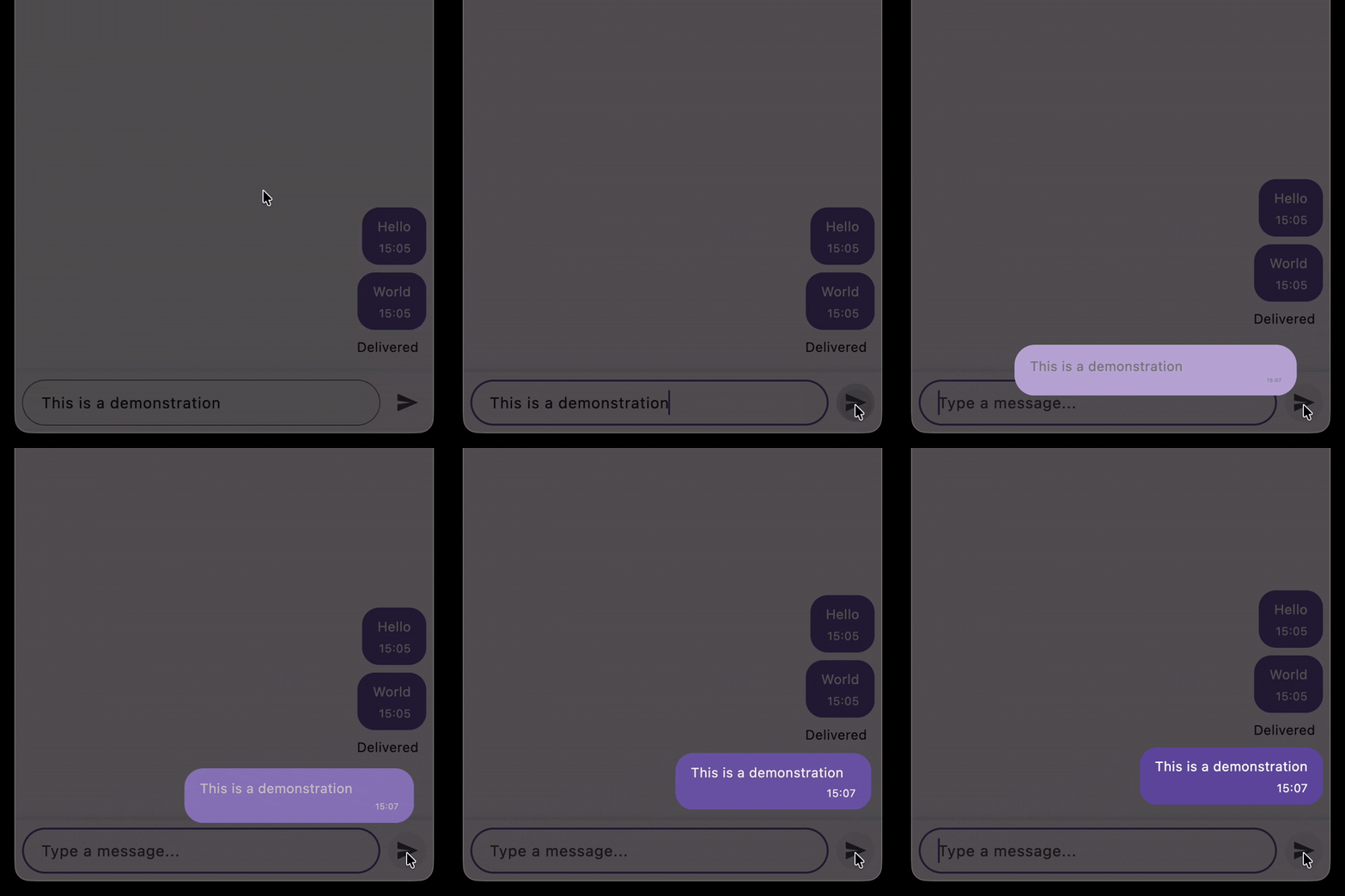
2. Lift up animation.
During the bubble transition, delivered messages are lifted up, that makes the space for the new message
- Size (placeholder height) animation
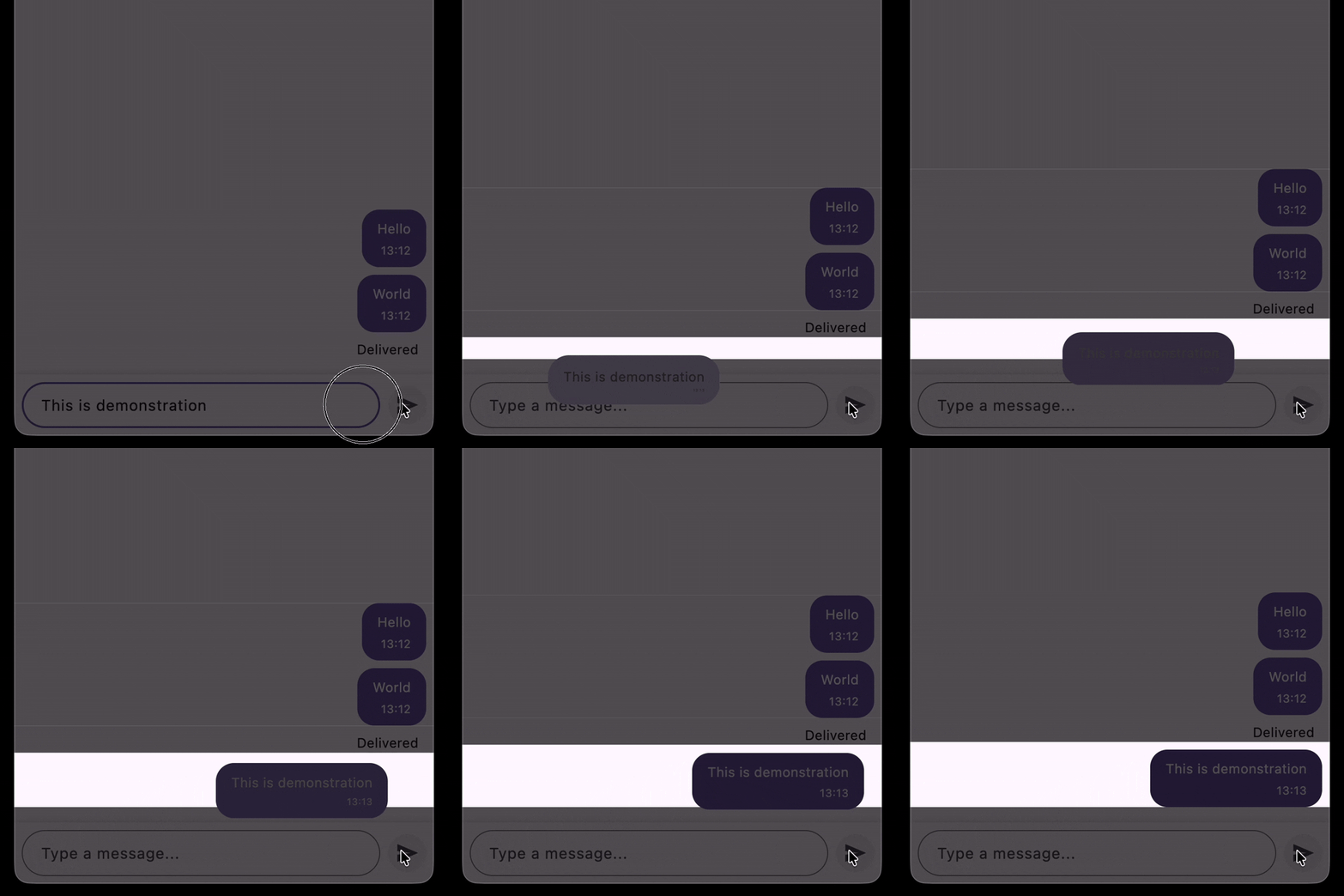
3. Slide up animation.
After the bubble transition, the message is sliding up over the “delivered” label
- Position animation
- Fade animation
- Scale animation
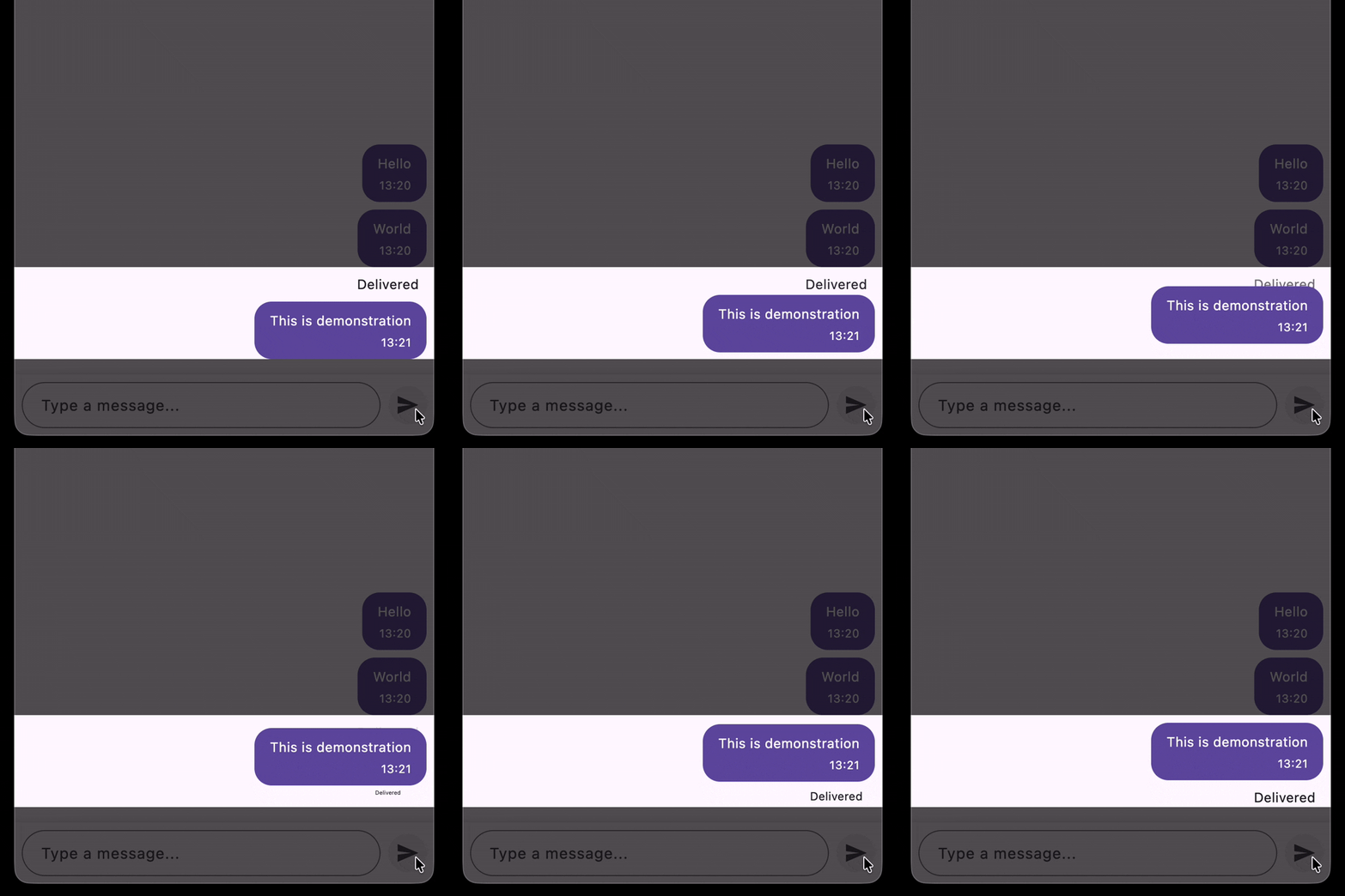
Of course, at the beginning of the development it’s hard to notice all the points above (especially point 2). In my case, they were revealed during the implementation, and I had to adjust the implementation several times to achieve the desired result. But the main point is that we can decompose the complex animation into smaller parts and implement them separately, and then combine them together to achieve the final result.
Defining the widgets to use for the animation
Official Flutter animations guide has the decision tree to choose the right animation widget. Let’s check this out for our case:
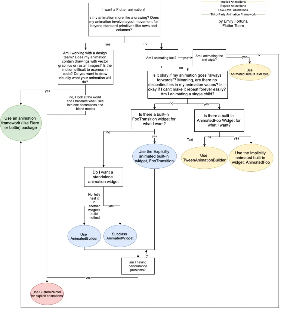
I want a Flutter animation! Is my animation more like a drawing? Does my animation involve layout movement far beyond standard primitives like rows and columns?
No. It doesn’t involve layout movement far beyond standard primitives, it can be described as a combination of position, size, color, padding, border radius and text style animations. Every effect can be implemented with standard Flutter animation widgets.
Am I animating text?
No. (Actually yes, but I don’t think AnimatedDefaultTextStyle is applicable for our case, because we need to animate text style together with other properties, and it can be achieved with other widgets that I’ll describe later).
Is it okay if my animation goes “always forwards”? Meaning, are there no discontinuities in my animation values? Is it okay if I can’t make it repeat forever easily? Am I animating a single child?
No. We have a complex animation, it’s not a single child animation, and it has discontinuities in animation values (for example, during the bubble transition, the message is flying from the text field to the position of the message in the chat, and then it slides up over the “delivered” label).
Is there a built-in FooTransition widget for what I want?
No. There are some built-in transition widgets that can be used for some of the effects (for example, SlideTransition can be used for position animation, SizeTransition can be used for size animation etc.), but there is no single built-in widget that can handle all the effects together.
Do I want a standalone animation widget
Not really. Actually I could use AnimatedWidget as well as some FooTransition widgets, but I’d like to focus on a single widget that can handle all the effects together.
I’ll use only the AnimatedBuilder widget for all the animations to show its abilities and to keep the implementation consistent and simple.
AnimatedBuilder is a widget that rebuilds its child every time an animation value changes. In simple terms, it lets you draw the same widget again and again with new values (like position, size, or color) so it looks animated.
Figure out the starting point of the implementation
We defined 3 main effects that we need to implement, but we need to figure out which effect to start with:
- Transition animation. Bubble flies from the text field to the position of the message in the chat
- Lift up animation. During the bubble transition, delivered messages are lifted up, that makes the space for the new message
- Slide up animation. After the bubble transition, the message is sliding up over the “delivered” label
It seems that it’s good to start with the first effect (transition animation), because it’s the main part of the animation. However, it depends on the start point (it’s the input field and it is already present) and the end point. But the end point is the position of the message in the chat, that is not present at the moment of sending the message.
The end point of transition is actually the position of the placeholder for the new message. So it’s better to start with the second effect (size animation of the placeholder), because it will create the end point for the first effect (transition animation).
Lift up animation
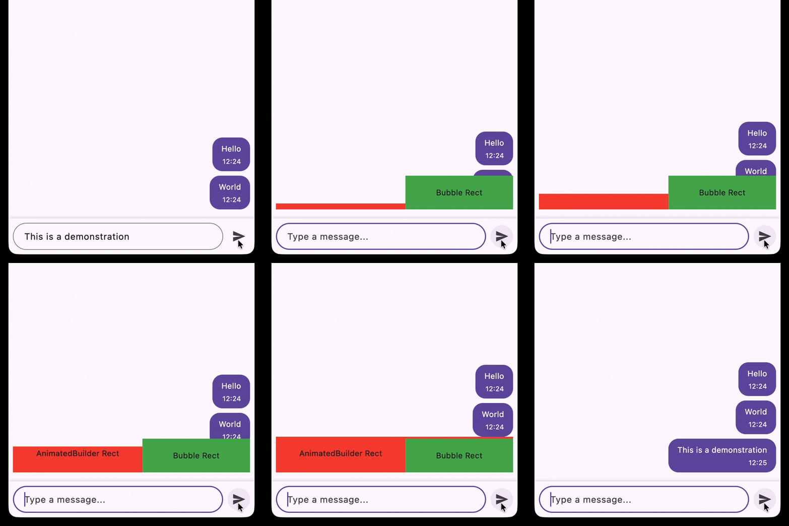
The goal is to lift up the bubbles list when the new message is sent. It can be achieved by adding a placeholder below the bubbles list, and animating its height from 0 to the height of the bubble.
Each animation consists of 4 main parts:
- Start point (initial size, position, color, etc.)
- End point (final size, position, color, etc.)
- Animation curve (how the animation values will change over time)
- Animation duration
Let’s define the start and end points for the lift up animation of the bubbles:
- Start point: zero height of the placeholder
- End point: height of the new message bubble
- Animation curve: it can be any suitable curve, let’s just select
Curves.decelerate - Animation duration: we’ll set 300 milliseconds
The position of the placeholder is fixed, it is below the bubbles list, so we just need to animate its height.
At this stage there are 2 main questions:
What widgets can be used for this animation?
We need to animate the height of the placeholder, which is actually the size of it. If we look for the widget that can animate the size, we can find SizeTransition widget. However, I promised to use only the AnimatedBuilder so let’s check the source code of SizeTransition:
class SizeTransition extends AnimatedWidget {
  // ...
  // Constructor and properties
  // ...

  @override
  Widget build(BuildContext context) {
    return ClipRect(
      child: Align(
        alignment: switch (axis) {
          Axis.horizontal => AlignmentDirectional(axisAlignment, -1.0),
          Axis.vertical => AlignmentDirectional(-1.0, axisAlignment),
        },
        heightFactor: axis == Axis.vertical
            ? math.max(sizeFactor.value, 0.0)
            : fixedCrossAxisSizeFactor,
        widthFactor: axis == Axis.horizontal
            ? math.max(sizeFactor.value, 0.0)
            : fixedCrossAxisSizeFactor,
        child: child,
      ),
    );
  }
}
As we can see, SizeTransition is based on Align widget, where the heightFactor or widthFactor is animated with the value of the sizeFactor animation. So we can actually implement the same animation with AnimatedBuilder and Align widget.
How can we calculate the height of the new message bubble?
The challenge is that the size of the new message bubble is dynamic, because it depends on the text length. It’s not possible to just specify a fixed height for the placeholder. We can resolve it in a simple way, the placeholder can actually be the new message bubble itself:
Next, we can just make it invisible with Visibility.maintain widget, so it will look like an empty space, but it will have the same size as the new message bubble:
Implementation
Finally, we can implement the placeholder widget using AnimatedBuilder, Align, and Visibility.maintain widgets:
class BubblePlaceholder extends StatelessWidget {
  const BubblePlaceholder({
    super.key,
    required this.animation,
    required this.text,
  });

  final Animation<double> animation;
  final String text;

  @override
  Widget build(BuildContext context) {
    return AnimatedBuilder(
      animation: animation,
      child: Visibility.maintain(
        visible: false,
        child: Padding(
          padding: .only(top: 8),
          child: Bubble(text: text, timestamp: DateTime.now()),
        ),
      ),
      builder: (context, child) {
        return Align(
          heightFactor: animation.value,
          alignment: Alignment.bottomRight,
          child: child,
        );
      },
    );
  }
}
The next steps are:
1. Add String _bubbleTransitionText = ''; to the ChatScreen widget to pass the text from the text field to the placeholder. Also it’s needed to initialize and dispose the animation controller and the animation itself in the ChatScreen widget.
  String _bubbleTransitionText = '';

  late final _bubbleTransitionController = AnimationController(
    duration: const Duration(milliseconds: 300),
    vsync: this,
  );
  late final _bubbleTransitionAnimation = CurvedAnimation(
    parent: _bubbleTransitionController,
    curve: Curves.decelerate,
  );

  @override
  void dispose() {
    _bubbleTransitionAnimation.dispose();
    _textController.dispose();
    _bubbleTransitionController.dispose();
    super.dispose();
  }
Since AnimationController requires a TickerProvider via the vsync parameter, we need to add the TickerProviderStateMixin mixin to the state class:
class _ChatScreenState extends State<ChatScreen> with TickerProviderStateMixin {2. Handle the animation inside the _sendMessage method:
- Set the
_bubbleTransitionTextto the text from the text field - Start the animation by calling
_bubbleTransitionController.forward() - Reset the animation after it completes by calling
_bubbleTransitionController.reset(), in order to be able to play it again for the next message
  Future<void> _sendMessage() async {
    if (_bubbleTransitionController.isAnimating) {
      return;
    }

    final text = _textController.text.trim();
    if (text.isEmpty) {
      return;
    }
    _textController.clear();

    setState(() {
      _bubbleTransitionText = text;
    });

    await _bubbleTransitionController.forward();
    _bubbleTransitionController.reset();

    if (!mounted) return;

    final newMessage = ChatMessage(text: text, timestamp: DateTime.now());
    setState(() {
      _messages = [newMessage, ..._messages];
      _bubbleTransitionText = '';
    });
  }
3. Add the BubblePlaceholder widget to the widget tree, below the bubbles list
              slivers: [
                SliverToBoxAdapter(child: const SizedBox(height: 16)),

                SliverPadding(
                  padding: .symmetric(horizontal: 8.0),
                  sliver: SliverToBoxAdapter(
                    child: BubblePlaceholder(
                      key: _bubblePlaceholderKey,
                      animation: _bubbleTransitionAnimation,
                      text: _bubbleTransitionText,
                    ),
                  ),
                ),

                SliverPadding(
                  padding: .symmetric(horizontal: 8.0),
                  sliver: SliverList.separated(
                    separatorBuilder: (context, index) =>
                        const SizedBox(height: bubbleSpacing),
                    itemCount: _messages.length,
                    itemBuilder: (context, index) {
                      final message = _messages[index];
                      return Align(
                        alignment: Alignment.centerRight,
                        child: Bubble(
                          text: message.text,
                          timestamp: message.timestamp,
                        ),
                      );
                    },
                  ),
                ),
              ],
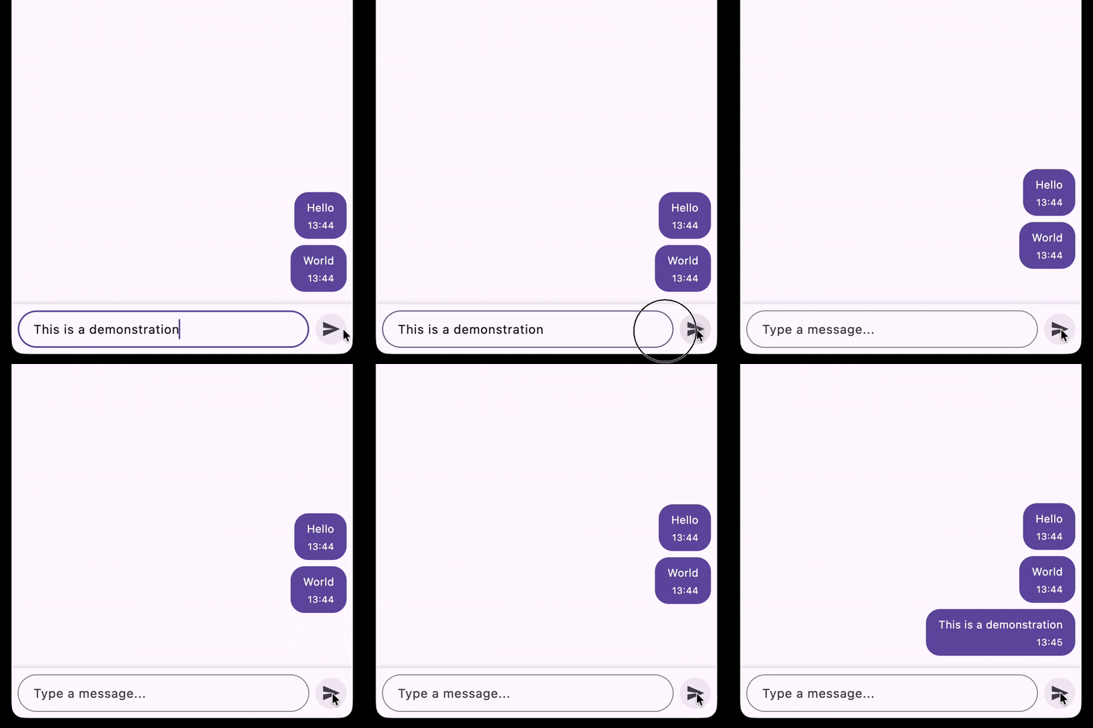
So the final result looks like this:
Transition animation
The goal is to animate the bubble flying from the text field to the position of the message in the chat. It involves animating the position, size, color, padding, border radius and text style of the bubble.
Start point:
- Position: the position of the text field
- Size: the size of the text field
- Shape: the shape of the text field (border radius, padding)
- Background color: white (the color of the text field)
- Text style: the style of the text field (font size, color)
End point:
- Position: the position of the message in the chat (the position of the placeholder)
- Size: the size of the message bubble
- Shape: the shape of the message bubble (border radius, padding)
- Background color: the color of the message bubble
- Text style: the style of the message bubble (font size, color)
Animation curve: Curves.decelerate
Animation duration: 300 milliseconds
The biggest challenge here is position and size animations, because it’s dynamic and depends on other widgets.
Get the position and size of the text field
Flutter provides a way to access a widget’s underlying render information through a GlobalKey. When you assign a GlobalKey to a widget, you can later call currentContext?.findRenderObject() on it to get the RenderBox which is a low-level object that knows everything about how the widget is painted on screen: its size, position, and transformation.
final _textFieldKey = GlobalKey();

// Later:
final renderObject = _textFieldKey.currentContext?.findRenderObject();
if (renderObject is RenderBox) {
  final offset = renderObject.localToGlobal(Offset.zero);
  final size = renderObject.size;
}
localToGlobal(Offset.zero) converts the widget’s local origin (top-left corner) into a global screen coordinate, exactly what we need to know where the bubble should start flying from.
Why addPostFrameCallback?
There’s a subtlety here. When _sendMessage is called, we update state and add the BubblePlaceholder to the widget tree. The placeholder’s position in the list is the end point of our transition, and the text field’s position is the start point. Both of these positions are only valid and stable after Flutter has finished laying out the current frame.
If we try to read the position immediately inside _sendMessage, we might get stale values or nothing at all, if the widget hasn’t been laid out yet. WidgetsBinding.instance.addPostFrameCallback solves this by scheduling a callback to run after the current frame is fully built and painted:
WidgetsBinding.instance.addPostFrameCallback((_) {
  // All widgets are laid out and painted — positions are safe to read here
  final rect = _textFieldKey.rect;
});
A convenient extension
To keep things clean, we can wrap the position/size retrieval logic into a GlobalKey extension:
extension on GlobalKey {
  Rect? get rect {
    final renderObject = currentContext?.findRenderObject();
    if (renderObject is! RenderBox) {
      return null;
    }
    final offset = renderObject.localToGlobal(Offset.zero);
    final size = renderObject.size;
    return offset & size;
  }
}
A Rect conveniently holds both the position and size in a single object. The & operator combines the offset and size into a Rect where the top-left corner is at the offset and the dimensions are given by the size.
Now we can assign GlobalKeys to both the text field and the placeholder, and after the frame is rendered, retrieve both their Rects to define the start and end points of the transition animation.
Keys initialization
Now let’s assign the GlobalKeys to the right widgets. We declare them in ChatScreen:
final _inputFieldKey = GlobalKey();
final _bubblePlaceholderKey = GlobalKey();
The first one goes to the TextField:
TextField(
  key: _inputFieldKey, // ← assign the key to the TextField
  controller: _textController,
  maxLines: null,
  decoration: const InputDecoration(
    hintText: 'Type a message...',
    border: OutlineInputBorder(
      borderRadius: BorderRadius.all(Radius.circular(24)),
    ),
    contentPadding: EdgeInsets.symmetric(
      horizontal: 16,
      vertical: 12,
    ),
  ),
),
The second one goes to BubblePlaceholder. But there’s an important detail — the key must be attached to the Bubble widget inside, not to AnimatedBuilder or Align.
The reason is that we need the Rect of the final bubble shape: its actual visual size and screen position. AnimatedBuilder and Align size is zero at the start of the animation. Their top right corner that is used as the anchor point is also changing its position during the animation, so it is not correct at the beginning of the animation and cannot be used as a stable reference point for the transition.
class BubblePlaceholder extends StatelessWidget {
  const BubblePlaceholder({
    super.key,
    required this.animation,
    required this.bubblePlaceholderKey,
    required this.text,
  });

  final Animation<double> animation;
  final Key bubblePlaceholderKey;
  final String text;

  @override
  Widget build(BuildContext context) {
    return AnimatedBuilder(
      animation: animation,
      child: Visibility.maintain(
        visible: false,
        child: Padding(
          padding: EdgeInsets.only(top: 8),
          child: Bubble(
            key: bubblePlaceholderKey, // ← attached to Bubble, not to AnimatedBuilder or Align
            text: text,
            timestamp: DateTime.now(),
          ),
        ),
      ),
      builder: (context, child) {
        return Align(
          heightFactor: animation.value,
          alignment: Alignment.bottomRight,
          child: child,
        );
      },
    );
  }
}
What is a Tween?
So far we’ve been working with Animation<double> — a value that goes from 0.0 to 1.0 over time. But for the transition animation we need to interpolate between two Rects, not two doubles. This is exactly what a Tween is for.
A Tween<T> describes how to interpolate between a begin and an end value of any type T. It has a single method that matters here: evaluate(animation), which maps the current 0.0–1.0 progress of the animation to the corresponding value between begin and end:
final tween = Tween(begin: 0, end: 100);
tween.evaluate(animation); // returns 0.0 at start, 100.0 at end, 50.0 at midpoint
Flutter ships with tweens for most common types: ColorTween, SizeTween, EdgeInsetsTween, BorderRadiusTween, and the one we need here — RectTween. It interpolates between two Rects, smoothly animating both position and size at the same time:
final rect = RectTween(
  begin: startRect,
  end: endRect,
).evaluate(animation);
At progress 0.0 this returns startRect (the text field), at 1.0 it returns endRect (the placeholder bubble), and everything in between is a smooth interpolation.
Implementing the size and position transition widget
Now we have all the pieces to build the widget that animates the flying bubble. The widget takes the animation, the start and end Rects, and the message text:
class BubbleTransition extends StatelessWidget {
  const BubbleTransition({
    super.key,
    required this.animation,
    required this.startRect,
    required this.endRect,
    required this.text,
  });

  final Animation animation;
  final Rect startRect;
  final Rect endRect;
  final String text;

  @override
  Widget build(BuildContext context) {
    return AnimatedBuilder(
      animation: animation,
      builder: (context, child) {
        final rect = RectTween(
          begin: startRect,
          end: endRect,
        ).evaluate(animation);

        return Positioned.fromRect(
          rect: rect!,
          child: SingleChildScrollView(
            physics: const NeverScrollableScrollPhysics(),
            child: Bubble(text: text, timestamp: DateTime.now()),
          ),
        );
      },
    );
  }
}
Positioned.fromRect places the Bubble at the exact position and size described by the current interpolated Rect. Since the Rect is interpolated from a larger text field size down toward the bubble size, the Bubble may shrink during the animation and overflow its constrained bounds. SingleChildScrollView gives the child unbounded height to render into, preventing overflow errors. NeverScrollableScrollPhysics disables any actual scrolling, so it’s purely a layout trick.
Overlay
The flying bubble needs to move freely across the entire screen — over the chat list, over the input field, unrestricted by any parent widget’s layout. Flutter’s Overlay is the right tool for this.
Overlay is a Stack-like widget that sits on top of the entire widget tree. It’s always present in a Navigator-based app and is the same mechanism used by tooltips, dropdowns, and modal routes. You insert an OverlayEntry into it with a builder that can position content anywhere on screen using global coordinates — exactly what we need for BubbleTransition with Positioned.fromRect.
Putting it all together in _sendMessage
All we have to do is just:
- Insert the
BubbleTransitioninto theOverlaywith the correct start and endRects - Start the animation
- Remove the
BubbleTransitionfrom theOverlaywhen the animation completes
Future<void> _sendMessage() async {
  if (_bubbleTransitionController.isAnimating) {
    return;
  }

  final text = _textController.text.trim();
  if (text.isEmpty) {
    return;
  }
  _textController.clear();

  setState(() {
    _bubbleTransitionText = text;
  });

  WidgetsBinding.instance.addPostFrameCallback((_) async { // wait until the frame is rendered to get correct Rects
    final startRect = _inputFieldKey.rect;
    final endRect = _bubblePlaceholderKey.rect;

    if (startRect == null || endRect == null) {
      return;
    }

    final overlayEntry = OverlayEntry(
      builder: (context) {
        return BubbleTransition(
          animation: _bubbleTransitionAnimation,
          startRect: startRect,
          endRect: endRect,
          text: _bubbleTransitionText,
        );
      },
    );

    Overlay.of(context).insert(overlayEntry); // Insert the flying bubble into the overlay and start the animation
    await _bubbleTransitionController.forward();
    _bubbleTransitionController.reset();
    overlayEntry.remove(); // Remove the flying bubble from the overlay after the animation completes

    final newMessage = ChatMessage(text: text, timestamp: DateTime.now());
    if (!mounted) return;
    setState(() {
      _messages = [newMessage, ..._messages];
      _bubbleTransitionText = '';
    });
  });
}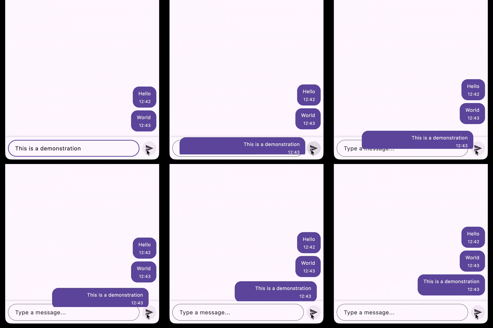
We use addPostFrameCallback because we first call setState to add the BubblePlaceholder to the tree, but we need to wait until the frame is rendered to get the correct Rect for the placeholder. The text field’s Rect is already stable at this point, so we can read both Rects safely.
Once both rects are available, we insert the OverlayEntry with BubbleTransition, run the animation, and then remove the entry. Only after the animation completes do we commit the real message to the list and clear the placeholder — so there’s no visual jump between the flying bubble and the final settled message.
Updating the Bubble widget to animate other properties (color, padding, border radius, text style)
The bubble position and size are animating nicely, but right now the bubble looks like a chat bubble from the very beginning. We need to also animate its visual appearance — color, padding, border radius, and text style. Let’s make all visual properties of Bubble configurable so BubbleTransition can drive them from the outside:
class Bubble extends StatelessWidget {
  const Bubble({
    required this.text,
    required this.timestamp,
    this.color,
    this.padding,
    this.borderRadius,
    this.messageTextStyle,
    this.timestampTextStyle,
    this.verticalSpacing,
    super.key,
  });

  final String text;
  final DateTime timestamp;
  final Color? color;
  final EdgeInsetsGeometry? padding;
  final BorderRadiusGeometry? borderRadius;
  final TextStyle? messageTextStyle;
  final TextStyle? timestampTextStyle;
  final double? verticalSpacing;

  @override
  Widget build(BuildContext context) {
    final theme = Theme.of(context);
    final colorScheme = theme.colorScheme;
    final textTheme = theme.textTheme;

    return Container(
      padding: padding ?? .symmetric(horizontal: 16, vertical: 10),
      decoration: BoxDecoration(
        color: color ?? colorScheme.primary,
        borderRadius: borderRadius ?? .circular(18),
      ),
      child: BoxyColumn(
        crossAxisAlignment: CrossAxisAlignment.start,
        children: [
          Text(
            text,
            style:
                messageTextStyle ??
                textTheme.bodyMedium?.copyWith(color: colorScheme.onPrimary),
          ),
          SizedBox(height: verticalSpacing ?? 4),
          BoxyFlexible.align(
            crossAxisAlignment: CrossAxisAlignment.end,
            child: Text(
              _formatTimestamp(timestamp),
              style:
                  timestampTextStyle ??
                  textTheme.bodySmall?.copyWith(color: colorScheme.onPrimary),
            ),
          ),
        ],
      ),
    );
  }

  String _formatTimestamp(DateTime timestamp) {
    return '${timestamp.hour.toString().padLeft(2, '0')}:'
        '${timestamp.minute.toString().padLeft(2, '0')}';
  }
}
The timestamp needs to be aligned to the trailing edge of the bubble, while the message text stays aligned to the leading edge. Standard Column with CrossAxisAlignment applies the same alignment to all children. BoxyColumn from the boxy package solves this — it lets each child override the cross-axis alignment individually via BoxyFlexible.align, so the message text and the timestamp can have different alignments within the same column. You’ll need to add boxy to your pubspec.yaml dependencies to use it.
Finishing BubbleTransition
Finally, we can complete the BubbleTransition by adding a Tween for each visual property and pass the interpolated values to Bubble:
class BubbleTransition extends StatelessWidget {
  const BubbleTransition({
    super.key,
    required this.animation,
    required this.startRect,
    required this.endRect,
    required this.text,
  });

  final Animation<double> animation;
  final Rect startRect;
  final Rect endRect;
  final String text;

  @override
  Widget build(BuildContext context) {
    return AnimatedBuilder(
      animation: animation,
      builder: (context, child) {
        final theme = Theme.of(context);
        final colorScheme = theme.colorScheme;
        final textTheme = theme.textTheme;

        // Define a tween for each property we want to animate
        final rect = RectTween(
          begin: startRect,
          end: endRect,
        ).evaluate(animation);
        final color = ColorTween(
          begin: colorScheme.surface,
          end: colorScheme.primary,
        ).evaluate(animation);
        final padding = EdgeInsetsGeometryTween(
          begin: .symmetric(horizontal: 16, vertical: 14),
          end: .symmetric(horizontal: 16, vertical: 10),
        ).evaluate(animation);
        final borderRadius = BorderRadiusTween(
          begin: .circular(24),
          end: .circular(18),
        ).evaluate(animation);
        final messageTextStyle = TextStyleTween(
          begin: textTheme.bodyMedium?.copyWith(color: colorScheme.onSurface),
          end: textTheme.bodyMedium?.copyWith(color: colorScheme.onPrimary),
        ).evaluate(animation);
        final timestampTextStyle = TextStyleTween(
          begin: textTheme.bodySmall?.copyWith(
            color: colorScheme.onSurface,
            fontSize: 0,
          ),
          end: textTheme.bodySmall?.copyWith(color: colorScheme.onPrimary),
        ).evaluate(animation);
        final verticalSpacing = Tween<double>(
          begin: 0,
          end: 4,
        ).evaluate(animation);

        return Positioned.fromRect(
          rect: rect!,
          child: SingleChildScrollView(
            physics: const NeverScrollableScrollPhysics(),
            child: Bubble(
              text: text,
              timestamp: DateTime.now(),
              color: color,
              padding: padding,
              borderRadius: borderRadius,
              messageTextStyle: messageTextStyle,
              timestampTextStyle: timestampTextStyle,
              verticalSpacing: verticalSpacing,
            ),
          ),
        );
      },
    );
  }
}
A few things worth noting:
- The
beginvalues match the visual appearance of the text field —colorScheme.surfacefor background,colorScheme.onSurfacefor text,BorderRadius.circular(24)for the rounded input shape. - The timestamp starts with
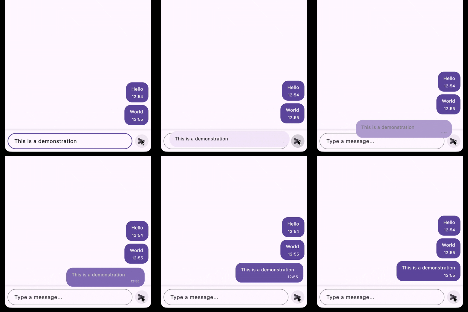
fontSize: 0so it’s invisible at the beginning and gradually appears as the bubble takes shape. verticalSpacingstarts at0and grows to4, so the space between message and timestamp also fades in together with the timestamp.
Each Tween is evaluated with the same animation value, so all properties animate in lockstep — the bubble smoothly transforms from text field to chat bubble as it flies across the screen.
Slide up animation
We are almost done! Let’s take a look at the last part of the animation — the message sliding up over the “delivered” label.

At the first glance, it may seem that the animation consists of:
- Moving up the bubble
- Moving down the “delivered” label with fade out and scale up effect
This approach requires using Stack and Positioned to handle the positions change. However, in order to calculate the position we should take into account the size of the bubble and the size of the “delivered” label, and it can be different for different messages. As for me, such approach would be too complex and hard to maintain.
I would like to suggest another approach. Actually, we can have 2 “delivered” labels.
- Top “delivered” label with fade out effect that reduces its size to zero and makes it invisible
- Bottom “delivered” label with scale up effect that increases its size from zero to the normal size and makes it visible
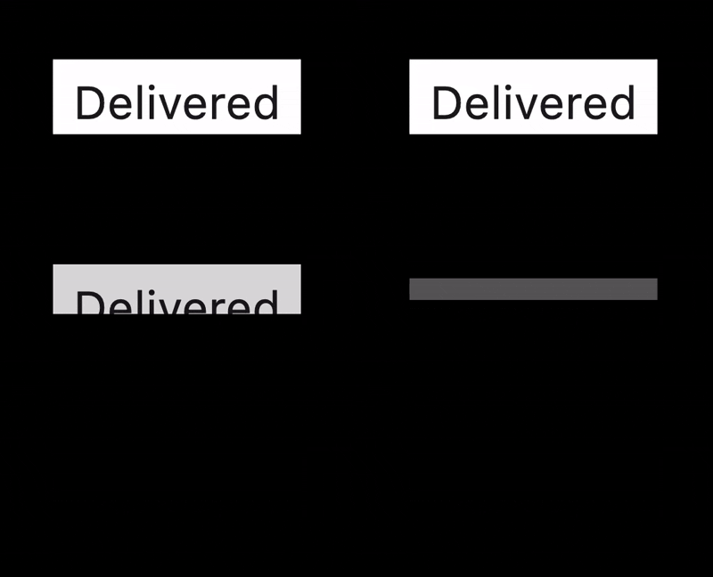
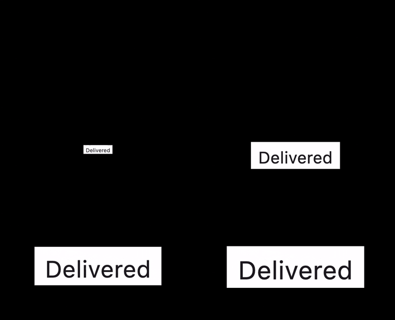
If combined together, it will look like the bubble is sliding up over the “delivered” label. The main advantage of this approach is that we don’t need to calculate the positions, we just need to animate the opacity, scale and size of the labels and we will achieve the desired result.
Define slide up animation parameters
Start point:
- Top “delivered” label: full opacity and size
- Bottom “delivered” label: zero scale and size
End point:
- Top “delivered” label: zero opacity and size
- Bottom “delivered” label: full opacity and size
Animation curve:
- Bubble sliding up:
Curves.decelerate - Top “delivered” label fade out:
Curves.easeIn - Bottom “delivered” label scale up:
Curves.easeOutSine
Animation duration:
- Total duration: 500 milliseconds
- Top “delivered” label fade out: first 300 milliseconds
- Bottom “delivered” label scale up: last 300 milliseconds
Multiple animations with a single AnimationController
The slide up animation consists of three things happening in parallel but at different times: the bubble sliding up, the top “delivered” label fading out and shrinking, and the bottom “delivered” label scaling up and growing in. Driving all of this from separate AnimationControllers would mean synchronizing them manually. Instead, we can use a single controller and derive multiple CurvedAnimations from it — each covering a different slice of the total duration.
This is what Interval is for. An Interval remaps the controller’s 0.0–1.0 progress to a sub-range, so the animation only runs during that portion of the total duration and stays clamped at 0.0 before it starts and 1.0 after it ends. The curve inside the Interval applies within that sub-range only.
Total: 0.0 ────────────────────────────── 1.0  (500ms)
Fade:  0.0 ────────────────── 0.6              (0–300ms, Curves.easeIn)
Scale:             0.4 ────────────────── 1.0  (200–500ms, Curves.easeOutSine)
The overlap between 0.4 and 0.6 is intentional. For a brief moment both animations are running simultaneously, which creates a smooth crossfade between the two “delivered” labels.
late final _bubbleSlideController = AnimationController(
  duration: const Duration(milliseconds: 500),
  vsync: this,
);

late final _bubbleSlideAnimation = CurvedAnimation(
  parent: _bubbleSlideController,
  curve: Curves.decelerate,
);

late final _deliveredLabelFadeAnimation = CurvedAnimation(
  parent: _bubbleSlideController,
  curve: const Interval(0.0, 0.6, curve: Curves.easeIn),
);

late final _deliveredLabelScaleAnimation = CurvedAnimation(
  parent: _bubbleSlideController,
  curve: const Interval(0.4, 1.0, curve: Curves.easeOutSine),
);
All three animations share the same _bubbleSlideController, so calling _bubbleSlideController.forward() once sets everything in motion.
Top “delivered” label with fade out effect
The first of the two label widgets handles the outgoing side of the crossfade: it fades the “Delivered” label out while simultaneously collapsing its height to make room for the incoming label sliding up from below.
class DeliveredLabelFade extends StatelessWidget {
  const DeliveredLabelFade({
    super.key,
    required this.fadeAnimation,
    required this.slideAnimation,
  });

  final Animation<double> fadeAnimation;
  final Animation<double> slideAnimation;

  @override
  Widget build(BuildContext context) {
    return AnimatedBuilder(
      animation: Listenable.merge([fadeAnimation, slideAnimation]),
      child: const DeliveredLabel(),
      builder: (context, child) {
        return Align(
          heightFactor: 1 - slideAnimation.value,
          alignment: Alignment.topRight,
          child: Opacity(opacity: 1 - fadeAnimation.value, child: child),
        );
      },
    );
  }
}
A few things worth noting:
Listenable.merge combines multiple animations into a single listenable. AnimatedBuilder accepts any Listenable, so passing Listenable.merge([fadeAnimation, slideAnimation]) means the builder will re-run whenever either animation ticks. This is the cleanest way to drive a widget from more than one animation without nesting multiple AnimatedBuilders.
heightFactor: 1 - slideAnimation.value collapses the label’s height as the slide progresses. At the start of the animation slideAnimation.value is 0.0, so heightFactor is 1.0. As the slide progresses, heightFactor shrinks toward 0.0, pushing the content above it upward.
Opacity: 1 - fadeAnimation.value fades the label out in parallel. At fadeAnimation.value = 0.0 the label is fully opaque, and by 1.0 it is fully transparent.
Bottom “delivered” label with scale up effect
DeliveredLabelScale is the mirror of DeliveredLabelFade. Where the fade widget collapses height and fades out, this one grows height and scales up, creating the incoming side of the crossfade.
class DeliveredLabelScale extends StatelessWidget {
  const DeliveredLabelScale({
    super.key,
    required this.scaleAnimation,
    required this.slideAnimation,
  });

  final Animation<double> scaleAnimation;
  final Animation<double> slideAnimation;

  @override
  Widget build(BuildContext context) {
    return AnimatedBuilder(
      animation: Listenable.merge([scaleAnimation, slideAnimation]),
      child: const DeliveredLabel(),
      builder: (context, child) {
        return Align(
          heightFactor: slideAnimation.value,
          alignment: Alignment.topRight,
          child: Transform.scale(
            scale: scaleAnimation.value,
            alignment: Alignment.topCenter,
            child: child,
          ),
        );
      },
    );
  }
}
The structure is symmetrical to DeliveredLabelFade, but with two differences:
heightFactor: slideAnimation.value grows from 0.0 to 1.0 instead of shrinking. At the start the label takes up no space, and as the slide progresses it expands to its full height. Since both widgets share the same slideAnimation, the height that DeliveredLabelFade gives up is exactly the height that DeliveredLabelScale claims — the total height of the bubble stays constant throughout the animation.
Transform.scale scales the label up from 0.0 to 1.0 with Alignment.topCenter as the anchor, so the label grows downward from its top edge. Combined with the height expansion, this produces the effect of the label appearing to slide in from just below the bubble.
Two message lists instead of one
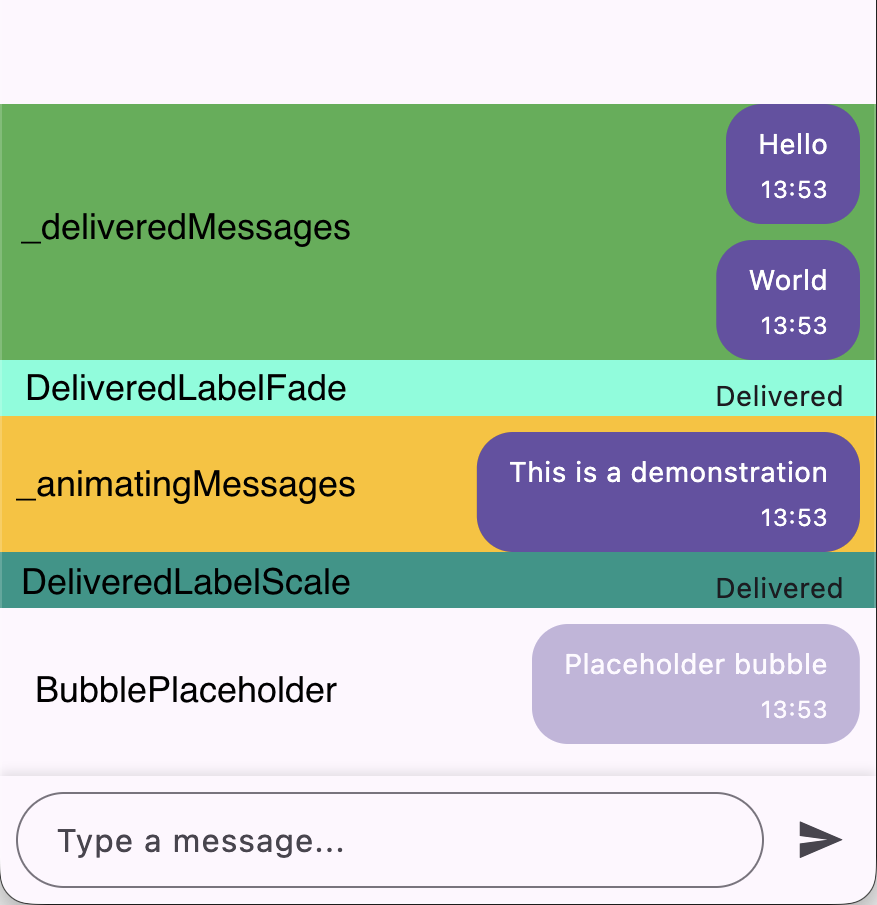
We will split the original _messages list into two:
var _animatingMessages = <ChatMessage>[];
var _deliveredMessages = <ChatMessage>[];
The reason is that the two “Delivered” labels act as a visual separator between messages that are in flight and messages that have already been confirmed.
By keeping two separate lists, the sliver layout becomes a direct reflection of the animation state. Since CustomScrollView uses reverse: true, the sliver declaration order in code is the opposite of what the user sees on screen. From the user’s perspective, top to bottom:
Updates to _sendMessage
The updated method orchestrates three sequential phases:
Future<void> _sendMessage() async {
  if (_bubbleTransitionController.isAnimating ||
      _bubbleSlideController.isAnimating) {
    return;
  }

  // ...

  WidgetsBinding.instance.addPostFrameCallback((_) async {

    // Phase 1: bubble flies from input field to placeholder position
    Overlay.of(context).insert(overlayEntry);
    await _bubbleTransitionController.forward();
    _bubbleTransitionController.reset();
    overlayEntry.remove();

    // Phase 2: message appears in _animatingMessages, below the delivered label
    setState(() {
      _animatingMessages = [newMessage, ..._animatingMessages];
      _bubbleTransitionText = '';
    });

    // Simulate network delay
    await Future.delayed(const Duration(seconds: 2));

    // Phase 3: slide animation moves the bubble above the delivered label
    await _bubbleSlideController.forward();
    _bubbleSlideController.reset();

    // Move the message from animating to delivered
    setState(() {
      _animatingMessages.remove(newMessage);
      _deliveredMessages = [newMessage, ..._deliveredMessages];
    });
  });
}
After the bubble transition completes, the message is added to _animatingMessages. It sits below DeliveredLabelFade which is still fully visible at this point, so the user sees the new message appear below the “Delivered” label. After a simulated network delay, we run the slide animation for DeliveredLabelFade and DeliveredLabelScale, creating the effect of the message sliding up over the “Delivered” label. Finally, we move the message from _animatingMessages to _deliveredMessages, which visually places it above the “Delivered” label in the list.
DeliveredLabelScale and DeliveredLabelFade in the widget tree
The final step is to update the widget tree to include both DeliveredLabelScale and DeliveredLabelFade in the right order, and conditionally based on whether there are messages in the corresponding lists.
// Grows upward, pushing _animatingMessages into view
SliverToBoxAdapter(
  child: DeliveredLabelScale(
    scaleAnimation: _deliveredLabelScaleAnimation,
    slideAnimation: _bubbleSlideAnimation,
  ),
),

if (_animatingMessages.isNotEmpty)
  SliverPadding(
    // ... the SliverList for _animatingMessages goes here. It's
    // identical to the one for _deliveredMessages, just with a different data source
  ),

// Fades and collapses away
if (_deliveredMessages.isNotEmpty)
  SliverToBoxAdapter(
    child: DeliveredLabelFade(
      fadeAnimation: _deliveredLabelFadeAnimation,
      slideAnimation: _bubbleSlideAnimation,
    ),
  ),
DeliveredLabelScale is always present in the tree even when _animatingMessages is empty, because it starts at zero height and takes up no space. DeliveredLabelFade is only added once there is at least one delivered message to sit below it, since an empty label above an empty list would serve no purpose.
Final results
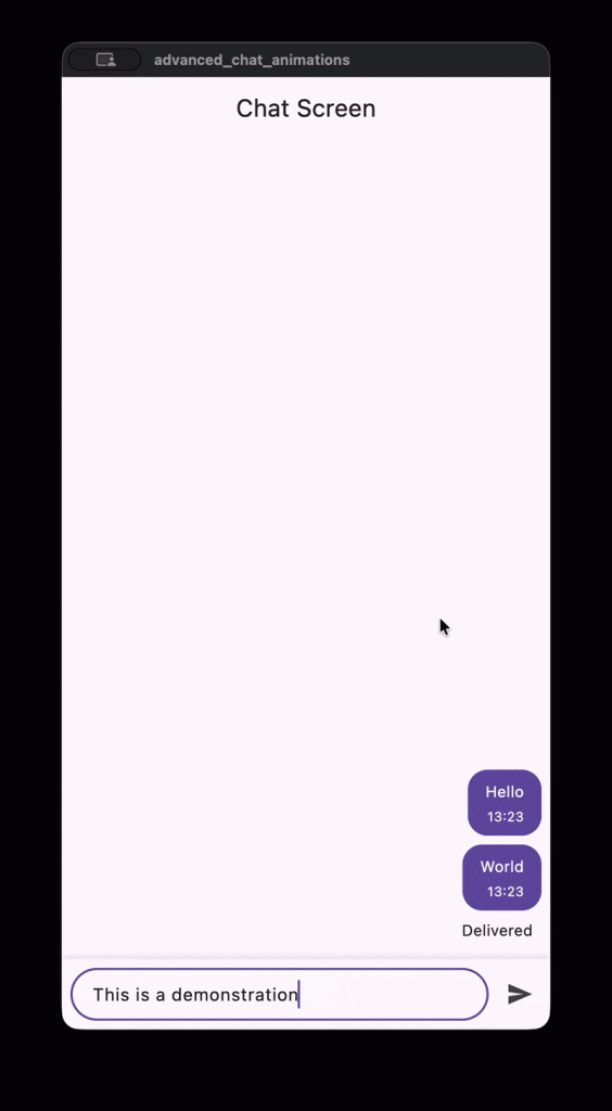
I’m happy to share the complete code for this animation in a GitHub repository:
https://github.com/theSharpestTool/chat_animations_challenge
As you can see, Flutter has powerful tools for building complex, custom animations that may seem daunting at first. Here is a quick recap of everything we used to bring this animation to life:
AnimatedBuilderwas the only animation widget used throughout the entire implementation. It handled position, size, color, padding, border radius, text style, opacity, scale and height — all from a single, consistent building block.Tweenand its variants (RectTween,ColorTween,TextStyleTween, etc.) handled interpolation between any two values across the animation progress.Intervalallowed multiple animations to share a singleAnimationControllerwhile each running on its own sub-range of the total duration.Listenable.mergelet a singleAnimatedBuilderreact to multiple animations at once without nesting.GlobalKeyandRenderBoxgave us the real-time screen position and size of any widget, which were essential for calculating the start and end points of the flying bubble.WidgetsBinding.instance.addPostFrameCallbackensured positions were read only after the frame was fully laid out.Overlaygave the flying bubble a free layer above the entire widget tree, so it could move across the screen unconstrained by any parent layout.Visibility.maintainkept the placeholder bubble in layout at its full size while keeping it invisible, giving us a stable anchor point for the transition end position.
By breaking the animation down into smaller pieces and combining these tools, we achieved a polished, engaging result with code that remains readable and maintainable.
I hope this walkthrough inspires you to experiment with your own custom animations in Flutter!